

You pick a paint color that looks perfect in the store, bring it home, and somehow the room feels off.
Too intense, too flat, or simply disconnected. The problem isn't the color itself—it's how it interacts with everything else. A well-designed palette is less about individual shades and more about proportion and balance.
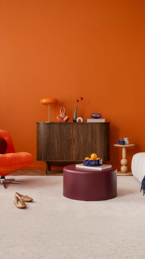
<h3>Understanding the 60-30-10 Rule</h3>
The 60-30-10 rule is a foundational guideline in interior design. It organizes color distribution so a space feels cohesive rather than chaotic.
1. <b>60%</b> – the dominant color that defines the room
2. <b>30%</b> – the secondary color that supports and contrasts
3. <b>10%</b> – the accent color that adds energy and focus
This structure works because it mirrors visual hierarchy. The dominant color creates consistency, the secondary adds variation, and the accent draws attention without overwhelming the space.
<h3>Choosing the Right Base Color</h3>
The 60% portion usually comes from walls, large furniture pieces, or flooring. This color sets the tone, so it should be versatile and comfortable to live with over time.
Neutral tones are often effective because they adapt easily to changing decor. However, neutral does not mean dull. Warm grays, soft beiges, or muted greens can provide depth while remaining flexible.
Before committing, test the color under different lighting conditions. Natural light in the morning and artificial lighting at night can shift how a color appears.
<h3>Building a Supporting Layer</h3>
The 30% color introduces contrast without competing for attention. It often appears in upholstery, curtains, or accent furniture.
The key is harmony. This color should complement the dominant shade while adding enough variation to avoid monotony. For example, pairing a warm base with a slightly deeper or cooler tone can create subtle tension that feels intentional.
To refine your choice:
1. <b>Stay within a related color family</b> for a cohesive look
2. <b>Adjust saturation</b> rather than switching to a completely different hue
3. <b>Use repetition</b> to reinforce the connection across the room
Consistency helps the space feel unified rather than fragmented.
<h3>Using Accent Colors Effectively</h3>
The final 10% is where personality comes in. Accent colors are often brighter or more saturated, designed to catch the eye.
These appear in smaller elements like cushions, artwork, or decorative objects. Because they occupy a limited portion of the room, they can be more expressive without overwhelming the overall design.
However, restraint is critical. Too many accent colors dilute their impact. One or two carefully chosen tones are usually enough.
<h3>Common Mistakes to Avoid</h3>
Even with a clear framework, it's easy to misapply the rule. Small missteps can disrupt the entire palette.
1. <b>Ignoring lighting</b> – colors shift depending on light sources
2. <b>Overusing accents</b> – turning 10% into 25% weakens the balance
3. <b>Choosing colors in isolation</b> – always evaluate them together
4. <b>Lack of contrast</b> – similar tones without variation can feel flat
A successful palette depends on relationships, not individual choices.
<h3>Adapting the Rule to Real Spaces</h3>
The 60-30-10 rule is flexible, not rigid. Real homes have unique layouts, existing furniture, and personal preferences that may require adjustments.
Open-plan spaces, for example, may blend multiple palettes while maintaining an overall balance. Smaller rooms might benefit from softer contrasts to avoid feeling crowded.
Think of the rule as a guide rather than a strict formula. It provides structure, but your interpretation gives it life.
<h3>A Room That Feels Intentional</h3>
Color has a quiet influence on how a space is experienced. When proportions are balanced, the room feels natural—nothing stands out for the wrong reasons, and everything works together.
Building a color palette is not about following trends or choosing bold shades at random. It's about creating relationships between colors that support how you live. Once that balance is achieved, even simple spaces can feel thoughtfully designed and complete.