

Step into two identical apartments—same layout, same square footage, same furniture placement—and they can feel entirely different.
One feels calm and restorative; the other feels restless and overstimulating. The difference often comes down to color.
Wall tones, furniture finishes, and decorative accents quietly influence mood, focus, and even how spacious a room appears. Understanding how these elements interact allows homeowners to design with intention rather than impulse.
<h3>Walls: The Emotional Backdrop</h3>
<b>1.Light Tones and Spaciousness</b>
Soft whites, warm beiges, and pale grays reflect more light, making rooms appear larger. In smaller apartments, a light wall color can visually expand boundaries by reducing harsh shadows. For example, a north-facing room with limited natural light benefits from a warm off-white rather than a cool, blue-based white, which might feel stark. The subtle warmth prevents the space from feeling clinical while preserving brightness.
<b>2.Deep Shades and Intimacy</b>
Contrary to popular belief, darker walls do not always shrink a room. Deep navy, charcoal, or forest green can create depth when balanced with lighter furniture. In bedrooms, these tones absorb excess light and foster relaxation. The psychological effect stems from enclosure; darker hues create a cocoon-like atmosphere that signals rest.
<b>3.Neutral Foundations for Flexibility</b>
Neutral walls provide adaptability. They allow furniture and décor to evolve over time without requiring repainting. A neutral base acts as a visual anchor, enabling bolder decorative elements to stand out without overwhelming the space.
<h3>Furniture: The Structural Color Layer</h3>
<b>1.Harmony Through Undertones</b>
Furniture should complement wall undertones rather than clash with them. A sofa in warm taupe pairs naturally with beige walls that carry subtle yellow undertones. In contrast, placing a cool gray sofa against a warm cream wall can create subtle tension. Observing undertones—whether warm, cool, or neutral—ensures cohesion.
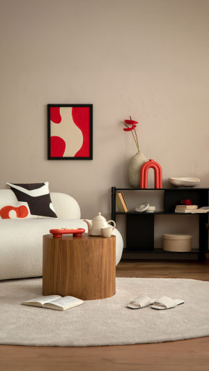
<b>2.Statement Pieces with Purpose</b>
A single bold furniture item can energize a neutral room. A mustard armchair or deep teal cabinet introduces personality while maintaining balance. The key is restraint: one or two strong colors maintain focus, while too many competing hues dilute impact.
<b>3.Material and Finish Influence</b>
Color perception shifts depending on material. Matte finishes absorb light and appear softer, while glossy surfaces reflect light and intensify color. A matte olive cabinet feels understated; the same shade in high gloss appears more vibrant. Considering finish alongside hue refines the emotional tone of a space.
<h3>Décor: The Emotional Accent</h3>
<b>1.Layered Textiles</b>
Cushions, rugs, and curtains allow seasonal or emotional adjustments without permanent commitment. Introducing warm-toned textiles during cooler months enhances coziness, while lighter fabrics brighten a room during warmer periods. Because textiles are easy to replace, they provide flexibility in experimenting with color psychology.
<b>2.Art and Visual Focal Points</b>
Artwork influences how surrounding colors are perceived. A large painting with warm reds and oranges can make adjacent neutral walls feel warmer. Conversely, artwork dominated by cool blues can calm an otherwise energetic space. Positioning art at eye level ensures it anchors the room rather than floating aimlessly.
<b>3.Metal and Reflective Accents</b>
Metallic finishes subtly shift mood. Brushed brass introduces warmth; chrome feels cooler and more modern. Even small decorative objects—lamp bases, frames, trays—contribute to the overall temperature of the room.
<h3>Psychological Impact in Daily Life</h3>
<b>1.Calming Zones</b>
Bedrooms and reading areas benefit from muted, low-saturation tones. Soft greens and gentle blues are often associated with tranquility because they resemble natural landscapes. When combined with warm lighting, these colors reduce visual tension.
<b>2.Energizing Spaces</b>
Home offices or dining areas can incorporate slightly brighter accents. Controlled pops of coral or golden yellow stimulate alertness without overwhelming concentration. The balance lies in moderation—vivid colors work best as accents rather than dominant backgrounds.
<b>3.Balanced Transitions</b>
Open-plan homes require thoughtful color transitions. Gradual shifts in tone—from a warm beige living area to a slightly deeper greige dining zone—maintain flow. Abrupt changes disrupt visual continuity and can make spaces feel fragmented.
Color coordination is not about rigid rules but about awareness. Every wall, chair, and decorative object participates in a larger conversation about mood and identity. When these elements align, the space feels coherent and supportive of daily routines. The next time you consider a new paint shade or statement sofa, pause to imagine how it will feel under evening light, during quiet mornings, or amid lively gatherings. A well-balanced palette does more than decorate—it shapes experience, one subtle shade at a time.